Macleod GLBA
Case study
Adcock Ingram: the Bioplus mother brand and the Panado upgrade
Adcock Ingram
Bioplus
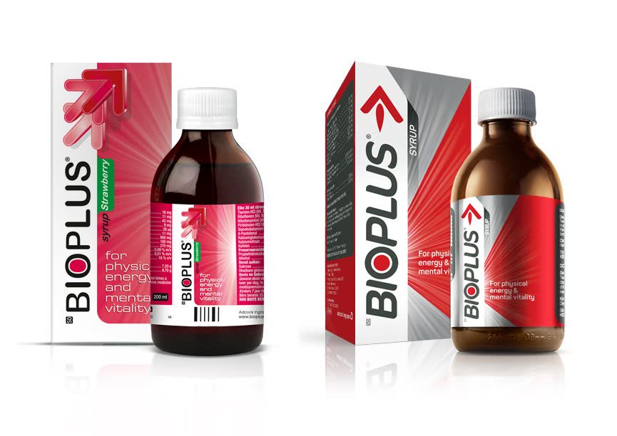
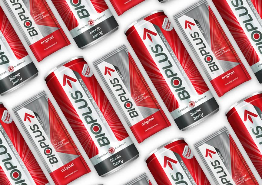
Bioplus began as a pharmacy-only energy tonic. The brief was to move it from medicinal to fast-moving and keep the arrow, the red and the logo. Stratcom built one mother brand over three ranges, Core, Health and Play, and migrated the old look to the new in staged steps, with shelf simulations against Play and Red Bull. A new 100ml syrup bottle and closure were pitched as part of the work.
The full story, with the logo steps and the renders, is on the Bioplus case page: /case/bioplus.
Panado
Panado is described in Stratcom’s own write-up as a household name in South Africa. The brief was to retain the equity and modernise and premiumise the logos and packaging. The files show a fine-tuned logo, enhanced colour, a metallic shine, clearer format navigation, a lion-led kids range, Panado Plus and a rethought tablet tub.
The full story is on the Panado case page: /case/panado. The files used here do not report sales results for either brand.